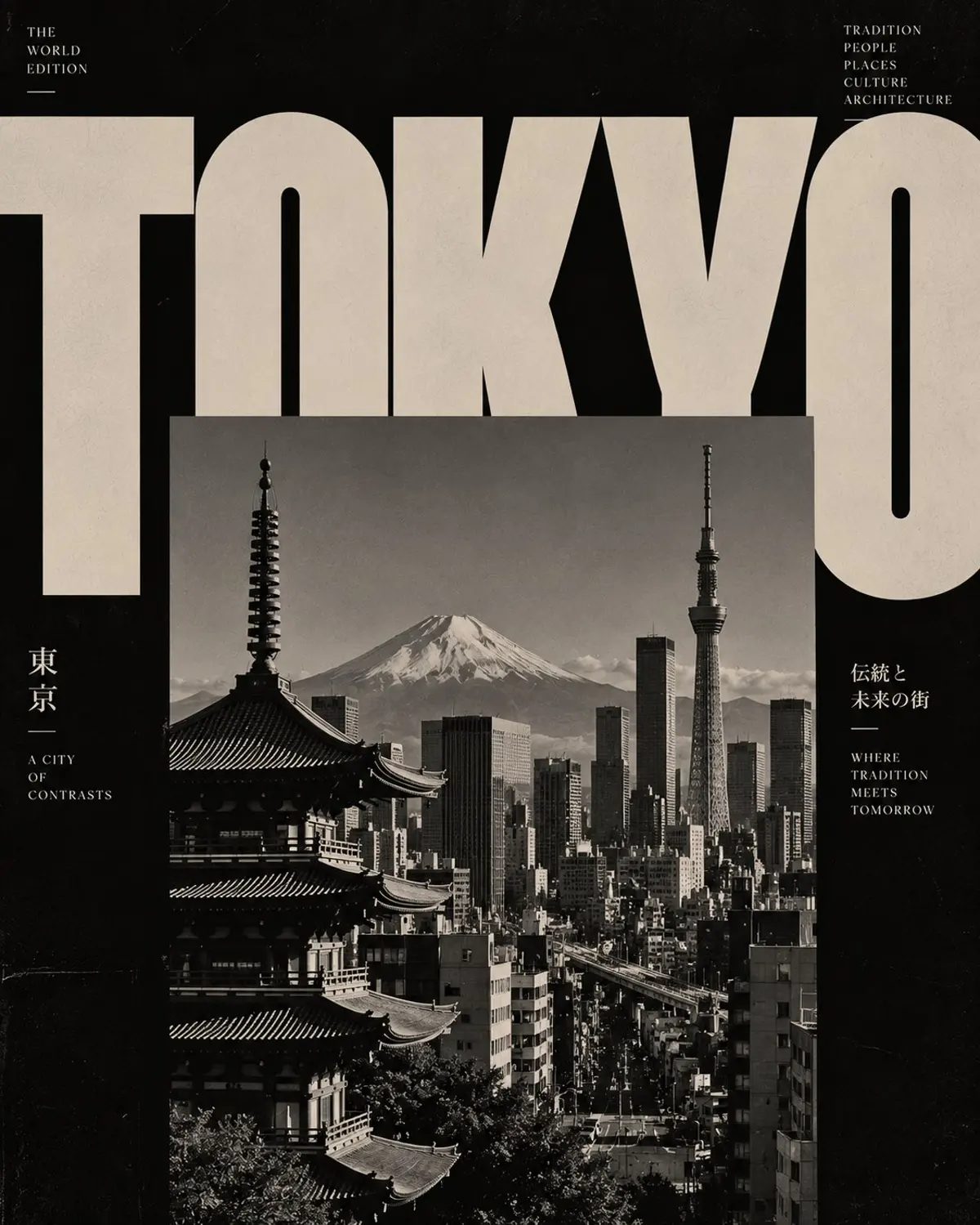
Oversized typography and monochrome architectural editorial posters
0
0
0
0
Prompt
Original · English
QCreate a striking, high-fashion architectural editorial poster featuring [CITY / COUNTRY / LANDMARK], inspired by vintage Swiss graphic design, brutalist architecture magazines and experimental typography.

Composition and layout:

* Use an oversized, bold uppercase destination name across the top of the composition.
* Let the typography extend beyond the edges of the canvas, creating dramatic cropping.
* Place a large rectangular black-and-white architectural photograph in the centre, partially overlapping the giant letters.
* Feature the destination’s most recognizable landmark, skyline or architectural structures in the photograph.
* Create an intentional contrast between typography and photography, allowing both elements to interact visually.
* Use a deep black background with warm grey, stone beige or muted ivory lettering.

Typography:
Choose an extremely bold, heavy serif or condensed editorial typeface. Make the destination name the dominant visual element. Experiment with cropped letters, oversized scale and unconventional spacing.

Photography:
Use authentic-looking monochrome architectural photography, dramatic natural shadows, strong geometric lines, deep blacks, subtle film grain and vintage photographic texture.

Art direction:
Minimalist, intellectual, sophisticated, experimental and timeless. Inspired by independent architecture journals and luxury design publications.

Technical composition: Vertical 4:5 format, asymmetrical editorial grid, generous negative space, high contrast, premium print aesthetic.

Important: Keep the landmark recognizable, maintain a clean visual hierarchy, avoid colourful illustrations, decorative graphics, gradients and unnecessary text. The final artwork should look like an exclusive architectural magazine cover rather than a conventional tourist poster.
Reference translation · 中文
Q创建一张以[城市 / 国家 / 地标]为主题、引人注目的高端时尚建筑编辑海报,灵感来自复古瑞士平面设计、粗野主义建筑杂志和实验性字体排版。

构图与布局:

* 在画面顶部横排超大、粗体、全大写的目的地名称。
* 让文字延伸至画布边缘之外,形成戏剧性的裁切。
* 在中央放置一张大型矩形黑白建筑照片,与巨大的字母部分重叠。
* 在照片中呈现该目的地最具辨识度的地标、天际线或建筑结构。
* 有意营造文字排版与摄影之间的对比,让二者在视觉上相互作用。
* 使用深黑色背景,搭配暖灰色、石米色或柔和象牙色文字。

字体排版:
选择极为粗重的衬线字体或窄体编辑字体。让目的地名称成为占主导地位的视觉元素。尝试裁切字母、超大尺度和非常规间距。

摄影:
使用看起来真实的单色建筑摄影、富有戏剧性的自然阴影、强烈的几何线条、深邃的黑色、细微胶片颗粒和复古照片质感。

美术指导:
极简、知性、精致、实验性且历久弥新。灵感来自独立建筑期刊和奢华设计出版物。

技术构图:竖版4:5格式、非对称编辑网格、充裕的留白、高对比度、高级印刷美学。

重要:保持地标可辨识,维持清晰的视觉层级,避免彩色插画、装饰性图形、渐变和不必要的文字。最终作品应像一本独家建筑杂志的封面,而不是常规旅游海报。
Parameters
GGPT Image 2.5
3:4
○○○○○
—
—
—
Comments
to join the conversation