Seasonal Nerikiri Wagashi Photo Posters
0
0
0
0
Prompt
Prompt (English)
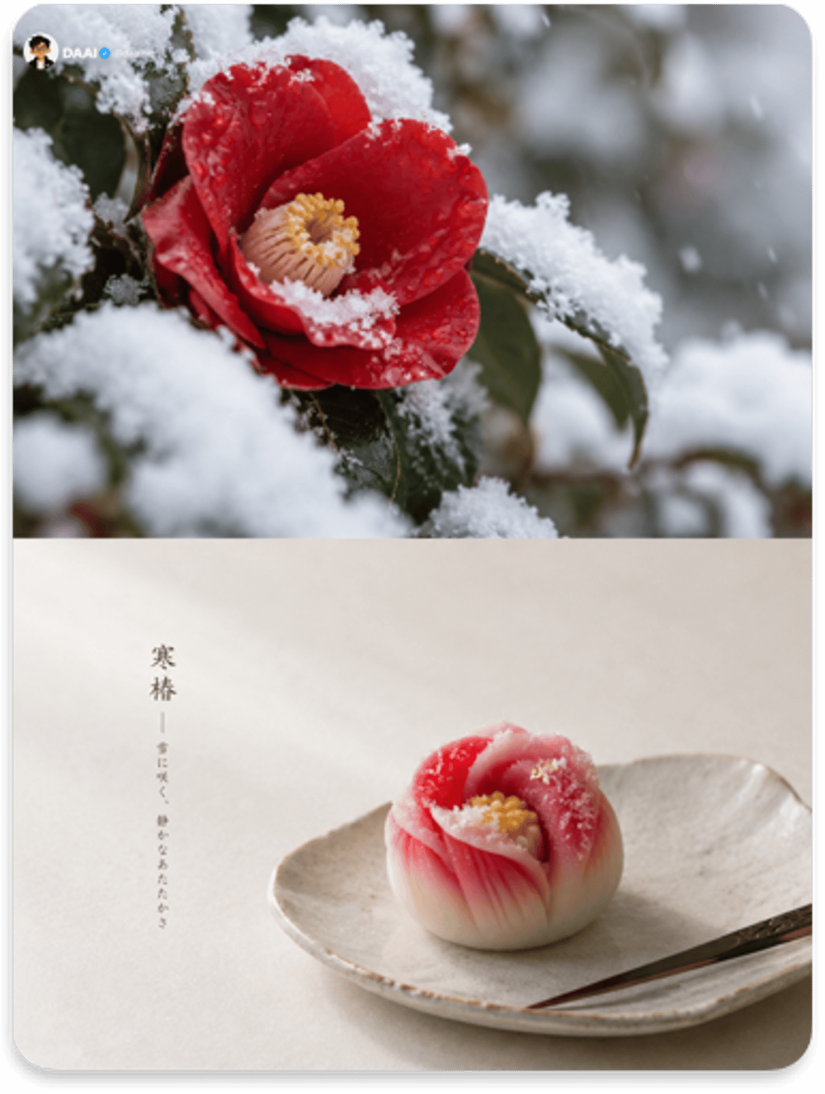
Please turn each photo I upload into its own separate high-end design poster. Do not combine multiple photos into a collage; output each photo separately. Use an overall 3:4 portrait composition, with the upper and lower regions strictly equal in height, each occupying 50% of the image.

Keep the original photo in the upper half, preserving the subject’s identity, structure, pose, realistic texture, natural light and shadow, and original color atmosphere. Apply only subtle, refined color grading to give it the feel of art photography and a lifestyle publication. You may naturally extend the surrounding background to fit the frame, but must not stretch, distort, or change the subject.

For the lower half, do not redraw the photo. First understand the original image’s season, mood, symbolism, and most memorable visual moment, then condense them into **a single Japanese nerikiri wagashi**. Distill the confection’s form from the subject’s contours, colors, and imagery: it may be an abstract embodiment of the subject, or a metaphor for its season or mood. At first glance, viewers should feel its correspondence with the photo above; only at second glance should they discover it is a confection.

Follow the handmade vocabulary of wagashi: fine lines pressed with a triangular tool, textures formed by twisting a tea cloth, fine particles created by passing paste through a sieve (kinton / きんとん), gradient-colored white bean paste forms, and tiny accents of gold leaf or sugar grains. Keep the form small, rounded, restrained, and highly simplified in detail; do not make a realistic sculpture.

Emphasize real food photography in the materials: the fine matte surface and microgranules of bean paste, soft curves left by finger pressure, and natural bleeding transitions between colors. Place the wagashi on a sheet of kaishi paper, a plain lacquer plate, or a small rustic ceramic dish. A kuromoji bamboo pick may sit beside it. Use soft side-window light and faint shadows. Avoid a plastic look, 3D rendering, excessive highlights, and the cloying feel of commercial candy imagery.

Build the composition around **one wagashi + a vast amount of negative space**. The subject should occupy only about 20%–30% of the lower half and may be slightly off-center; the vessel may extend partly beyond the frame. Use a clean, flat background in warm white, pale gray-beige, or pale ink tones, as quiet as a pause during a tea gathering.

Extract the 2–3 most seasonal colors from the photo above and translate them into the soft pastel colors characteristic of wagashi: cherry-blossom pink, young-grass green, wisteria purple, persimmon orange, snow white, chestnut brown, and so on, varying naturally with the original image. Keep the colors elegant and clear, never muddy gray.

Introduce only a little text: give this wagashi a poetic “kamei,” or confection name, like a seasonal word or a word from a haiku. Place it in small vertical lettering within the negative space; an extremely small line of explanation may accompany it. The language is unrestricted.

The overall restrained visual should be formed by **nerikiri wagashi, seasonal pastels, kaishi paper and lacquerware, soft side-window light, and a vast amount of negative space**. The core principle: do not turn the photo into a dessert; mold the season within the photo into a bite of edible poetry. Avoid piles of multiple confections, table-filling arrangements, plastic imitation, cheap dessert advertising, a cartoon feel, and templated typography/layout.
Prompt (Chinese)
请将我上传的每一张照片分别制作成一张独立的高级设计海报,不多图拼接,每张照片单独输出。整体采用 3:4 竖版构图,上下两个区域高度严格 1:1,各占画面 50%。

上半部分保留原始照片,保持主体身份、结构、姿态、真实质感、自然光影与原有色彩氛围,仅进行轻微高级调色,使其具有艺术摄影与生活方式出版物质感。为适配画幅,可自然扩展环境背景,但不得拉伸、扭曲或改变主体。

下半部分不要转绘照片,而是先理解原图的季节、情绪、象征与最值得被记住的视觉片刻,再将其浓缩为**一颗日式练切和菓子 / nerikiri wagashi**。和菓子的造型从主体的轮廓、色彩与意象中提炼:可以是主体的抽象化身,也可以是它所在季节或情绪的隐喻,使人看一眼就能感受到与上方照片的对应关系,再看一眼才发现这是一颗点心。

造型语言遵循和菓子的手作语法:用三角刀压出的细线、茶巾绞出的纹理、过筛形成的细碎颗粒(きんとん)、渐变色的白豆沙团和极小的金箔或糖粒点缀。形体小巧、圆润、克制,细节高度概括,不做写实雕塑。

材质强调真实食物摄影:豆沙表面的细腻哑光与微颗粒、手指按压留下的柔和弧度、颜色之间自然的晕染过渡。和菓子放在一张怀纸或一枚素色漆盘、粗陶小碟上,旁边可放一根黑文字竹签,光线为柔和侧窗光,阴影浅淡。避免塑料感、3D 渲染、过度高光和甜腻的商业糖果感。

构图以**一颗和菓子 + 极大量留白**为核心。主体只占下半部分约20%–30%,可略偏心,器皿可局部出画,背景为暖白、浅灰米或淡墨色的纯净平面,安静得像一次茶席的停顿。

配色从上方照片中提取 2–3 种最有季节感的颜色,转化为和菓子特有的柔和淡彩:樱粉、若草绿、藤紫、柿橙、雪白、栗茶等随原图自然变化,清雅而不灰脏。

文字少量介入:为这颗和菓子起一个诗意的“菓铭”,像季语或俳句里的词,以细小竖排字落在留白处,可附一行极小的说明,不限制语种。

整体呈现**练切和菓子、季节淡彩、怀纸漆器、侧窗柔光与极大量留白**共同构成的克制视觉。核心原则是:不是把照片做成甜点,而是把照片里的季节捏成一口可以吃下去的诗。避免多颗堆砌、满桌摆盘、塑料仿真、廉价甜品广告、卡通感和模板化排版。
Parameters
3:4
○○○○○
—
—
—
Comments
to join the conversation