0
0
0
0
GGPT-Image-2
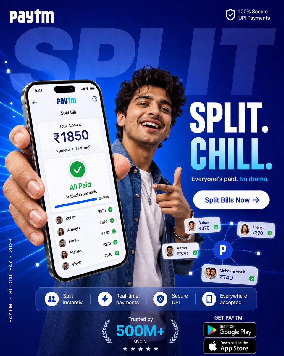
4:5 vertical SMM performance ad, ultra-high resolution (8K), Instagram + paid ads + app installs
Style: Bold Gen-Z layout (Paytm-style) × expressive human emotion × product-first UI × high-conversion fintech creative

🧠 CORE INTENT:
Money between friends should feel easy, fun, and natural.

No tension.
No reminders.
Just shared moments.

🎯 CAMPAIGN OBJECTIVE:
Increase app installs + boost “Split Bill” usage among young users

Primary KPI:
→ Open app → Split → Everyone pays instantly

🎬 SCENE COMPOSITION:

BACKGROUND:
Large rounded rectangle block in rich PhonePe purple gradient
(#5F259F → #7B3FE4 with soft radial glow)

Overlay typography (huge, cropped behind subject):
“SPLIT”
bold uppercase, ultra-heavy
opacity ~12% white

👤 SUBJECT:

Young Indian female (18–28), stylish, relatable
- casual chic outfit (oversized shirt / crop top + denim)
- subtle accessories (rings, nails, maybe headphones around neck)

POSE:
- leaning slightly forward
- holding phone toward camera (hero perspective)
- other hand mid-gesture (laughing / pointing / reacting)

EXPRESSION:
genuine laugh / smile — energetic, social, alive

MOOD:
warm, lively, slightly playful

📱 PRODUCT (HERO ELEMENT):

Phone large in foreground (slight perspective distortion)

SCREEN UI (PhonePe):

TOP:
“Split Expense”

CENTER:
₹1850 total

BREAKDOWN:
5 people → ₹370 each

STATUS:
✔ All Paid

SUBTEXT:
“Settled in seconds”

MICRO DETAILS:
- green ticks beside each name
- subtle glow pulse
- soft completion animation feel

IMPORTANT:
UI must feel native, clean, believable

✨ GRAPHIC SYSTEM:

- playful floating dots (lavender + white)
- soft connector lines between people (friendship cue)
- rounded UI cards floating lightly
- glow halo behind subject + phone

🎨 COLOR SYSTEM:

PRIMARY:
PhonePe purple (dominant)

SECONDARY:
Lavender / soft white

ACCENT:
Green (payment success only)

SKIN TONES:
Natural, warm (important for realism)

💡 LIGHTING:

- soft studio + ambient café mix
- gentle highlight on face
- UI glow reflecting slightly on fingers
- soft shadow separation

✍️ TYPOGRAPHY SYSTEM:

TOP LEFT:
PhonePe logo (white)

TOP RIGHT (TRUST BADGE):
“UPI Secure” (minimal)

CENTER HEADLINE (BOLD):

“SPLIT. CHILL.”

SUBLINE:
“Everyone’s paid. No drama.”

MID CTA BUTTON (IMPORTANT):

Rounded pill:

“Split Bills Now →”

Color:
White button with purple text

Soft drop shadow

BOTTOM FEATURE STRIP:

[👥] Split instantly
[⚡] Real-time payments
[🔒] Secure UPI
[📲] Everywhere accepted

Clean, evenly spaced

⬇️ DOWNLOAD CTA:

BOTTOM RIGHT:

“GET PHONEPE”

- Google Play badge
- App Store badge

BOTTOM CENTER (SOCIAL PROOF):

“Trusted by 500M+ users”

LEFT EDGE (VERTICAL MICRO TEXT):

“PHONEPE · SOCIAL PAY · 2026”

📐 COMPOSITION:

- Phone = primary focal point
- Subject = emotional hook
- Typography layered behind

Eye flow:
Face → Phone → “All Paid” → Headline → CTA → Download

🎥 CAMERA STYLE:

- 35mm slight wide angle
- slight perspective exaggeration (Gen-Z feel)
- sharp subject, soft background

🔥 PERFORMANCE LAYER:

- Emotion-driven (laughter = relatability)
- Outcome shown (All Paid)
- Clear CTA (Split Bills Now)
- Strong visual hook (girl + gesture + color)

✨ FINAL FEEL:

Not just a payment ad —

A moment between friends.

Fast.
Fun.
Effortless.

Feels like:
“Yeah, let’s just split it.”
参数
GGPT-Image-2
3:4
○○○○○
—
—
—
Comments
to join the conversation