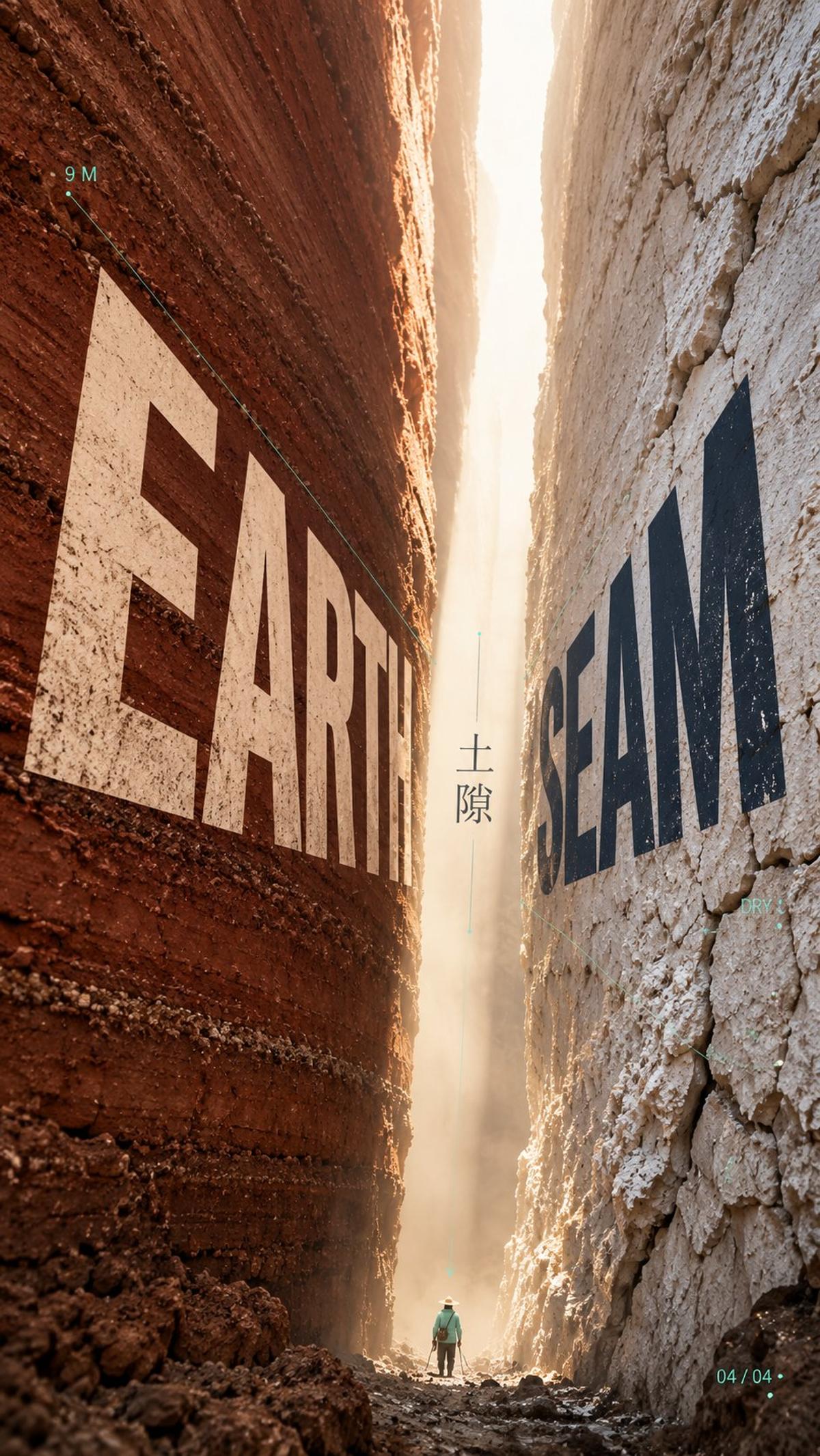
Natural Crevice Poster with Receding Perspective Typography
0
0
0
0
Prompt
Prompt (English)
[Theme]: e.g. ice crevice / rock crevice / forest gap / earth fissure
[English title]: Divide it into two groups, placed on the left and right material surfaces respectively, e.g. ICE / INTERVAL
[Huge left material]: A natural material at an enormous scale; describe its texture and light and shade
[Huge right material]: A natural material contrasting with the left; describe its translucency and light and shade
[Central crevice light]: A beam of light entering the crevice; describe its color and the edges it illuminates
[Tiny figure at the bottom]: An extremely small person; specify clothing color (matching the accent color)
[Main palette]: 2–3 low-saturation natural colors
[Accent color]: One highly saturated color; do not use a blue-orange combination, e.g. lime green / magenta / bright yellow
[Auxiliary annotations]: 2–3 extremely short index-like labels, e.g. parameters, numbers, directions
[Aspect ratio]: 9:16

Generate an editorial design poster combining a “crevice composition” with “oblique perspective planar typography”: enormous natural masses with realistic photographic texture frame a slit of light. Instead of lying flat across the image, the title is arranged as two groups of tilted two-dimensional text planes, receding into depth along the perspective of the crevice.

Compositional framework: An enormous natural material enters the frame from each side, cropped by the edges and pressing toward the center, leaving a narrow gap running from top to bottom. The light and air in this gap are the poster’s visual protagonists. Tilt the gap slightly; do not make it straight or bilaterally symmetrical.

Materials: On the left is [Huge left material], and on the right is [Huge right material]. The two sides must differ clearly: one opaque, dark and weighty; the other translucent, pale and soft. Inside the gap is [Central crevice light]. Keep the interior bright and clean, without filling it with complex scenery. The enormous forms should be noticed before the material details.

Typography: Title: [English title]. Each group of letters resembles a flat printed panel placed in a tilted two-dimensional plane, compressed in perspective along the direction of its material surface: larger nearby, smaller farther away, narrower and smaller toward the crevice, all pointing to the same vanishing point deep inside it. Keep sharp, flat vector edges and clear readability. No 3D extrusion, drop shadows, glass or metallic texture, or simulated engraving into the material. Use warm ivory for the lettering on the left and deep indigo ink for the lettering on the right.

Vector support system: Draw a few extremely fine guide lines in [Accent color]: two or three thin lines converging toward the vanishing point along the perspective, a small arrow pointing toward the bottom of the gap, and a few tiny dots. These belong to the flat typographic system, extend the text’s tilted direction, and occupy only a very small area. Place a smaller Chinese title, [Theme], vertically inside the gap, using a delicate, restrained modern Song typeface.

Tiny figure at the bottom: At the bottom of the crevice is [Tiny figure at the bottom], occupying an extremely small area and creating a clear contrast in scale with the enormous materials.

Auxiliary annotations: Add a very small amount of [Auxiliary annotations], resembling index notes in editorial design. Use small type at material edges or in negative space; do not create information boxes.

Color: Use [Main palette] throughout, keeping it low-saturation, matte and restrained. The only highly saturated color is [Accent color], appearing solely in the vector lines, arrow and tiny figure.

Visual hierarchy: From a distance, the slit of light between the two enormous forms and the two obliquely receding groups of lettering are seen first. Only up close do the material textures, guide lines, tiny index labels and miniature figure become apparent.

Avoid: Ordinary landscape photography, travel posters, heroic explorer poses, front-facing flat titles, 3D extruded lettering, heavy drop shadows, glass or metallic lettering, complex backgrounds, textures and lines covering the whole image, multiple accent colors, strong HDR, CGI materials and meaningless English.
Prompt (Chinese)
【主题】:如冰隙 / 石隙 / 林隙 / 土隙
【英文标题】:拆成两组,分别排在左右两面材质上,如 ICE / INTERVAL
【左侧巨大材质】:一种尺度巨大的自然材质,写出质地与明暗
【右侧巨大材质】:与左侧形成对比的自然材质,写出透明度与明暗
【中央裂隙光线】:一道光落入裂隙,写出光的颜色与它照亮的边缘
【底部微小人物】:一位极小的人物,写出衣着颜色(与点缀色一致)
【主色调】:2–3 种低饱和自然色
【点缀色】:一个高饱和色,不用蓝橙组合,如酸橙绿 / 品红 / 亮黄
【辅助标注】:2–3 条极短的索引式小字,如参数、编号、方向
【画幅比例】:9:16

生成一张编辑设计海报,把“夹缝构图”和“斜向透视平面字体”合成一件作品:真实摄影质感的巨大自然实体夹出一道光缝,而标题不是平铺在画面上,而是被排成两组倾斜的二维文字平面,沿着裂隙的透视方向向深处收缩。

构图骨架:画面左右各有一面尺度巨大的自然材质进入画幅并被边缘裁切,向中央挤压,中间留出一条从顶到底的窄缝,缝里的光和空气是整张海报的视觉主角。缝略微倾斜,不要笔直,也不要左右对称。

材质:左侧是【左侧巨大材质】,右侧是【右侧巨大材质】,两侧必须有明显差异,一侧不透明深重,一侧半透明浅柔。缝里是【中央裂隙光线】,内部保持明亮干净,不填入复杂风景。先看到巨大形体,再看到材质细节。

文字:标题【英文标题】,每一组字都像一块平面的印刷面板,被放进倾斜的二维平面里,贴着所在材质表面的走向做透视压缩,近大远小,越靠近裂隙越窄越小,全部指向裂隙深处的同一个消失点。文字保持平面矢量的锐利边缘,清晰可读,不做 3D 挤出、不加投影、不做玻璃或金属质感,也不模拟刻在材质上。左面的字使用暖米白,右面的字使用深靛墨色。

向量辅助系统:用【点缀色】画少量极细的辅助线:两三条沿透视方向收向消失点的细线、一个指向缝底的小箭头、几个细小的点。它们属于文字的平面系统,延伸文字的倾斜方向,只占画面很小的面积。缝内竖排一个较小的中文标题【主题】,使用纤细、克制的现代宋体。

底部微小人物:裂隙底部有【底部微小人物】,只占画面的极小面积,与巨大材质形成明显的比例反差。

辅助标注:加入极少量【辅助标注】,模拟编辑设计里的索引注释,小字号,放在材质边缘或留白处,不形成信息框。

配色:整体使用【主色调】,保持低饱和、哑光、克制;唯一的高饱和色是【点缀色】,只出现在向量线、箭头和微小人物上。

视觉层级:从远处看,先看到两侧巨大形体夹出的光缝和斜向收缩的两组字;近看才发现材质纹理、辅助线、索引小字和微小人物。

避免:普通风景摄影、旅游海报、探险英雄姿势、正面平铺的标题、3D 挤出字、厚重投影、玻璃字或金属字、复杂背景、满屏纹理和线条、多种点缀色、强 HDR、CGI 材质和无意义英文。
Parameters
9:16
○○○○○
—
—
—
Comments
to join the conversation